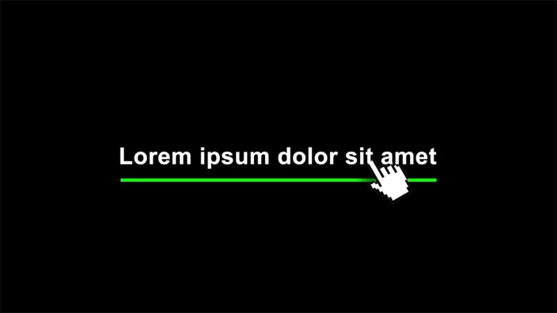
Creating a visually appealing and user-friendly website is essential. CSS provides various animation techniques that can add dynamism to your pages. In this tutorial, you will learn how to create a sleek underline animation that appears and disappears when hovering over text or links. This simple yet effective technique can enhance your web projects with a stylish touch.
HTML Structure
The first step is to set up the basic HTML structure where we will apply the animation. Create a file named index.html and add the following code:
<!DOCTYPE html>
<html lang="en">
<head>
    <meta charset="UTF-8">
    <meta name="viewport" content="width=device-width, initial-scale=1.0">
    <title>Underline Animation</title>
    <link rel="stylesheet" href="style.css">
</head>
<body>
    <p class="text">Lorem ipsum dolor sit</p>
</body>
</html>
In this code, we create a sample paragraph (p) element and assign it a class called text. We also link our CSS file to style the animation.
Creating the Underline Animation with CSS
Now that we have our HTML structure ready, let's write the CSS code to implement the animation. Create a file named style.css and add the following styles:
body {
    font-family: monospace;
    font-size: 1.25rem;
    background-color: #111;
    color: #fff;
    padding: 1rem;
    width: 100%;
    min-height: 100vh;
    display: flex;
    align-items: center;
    justify-content: center;
}

p.text {
    display: inline-block;
    padding-bottom: 0.25rem;
    position: relative;
}

p.text::before {
    content: "";
    position: absolute;
    left: 0;
    bottom: 0;
    width: 0;
    height: 2px;
    background-color: rgb(0, 255, 0);
    transition: width 0.25s ease-out;
}

p.text:hover::before {
    width: 100%;
}
With this CSS code, we create an underline animation that appears when hovering over the text. The key steps involved are:
- Body Styling: We define the page’s general appearance using a monospace font, dark background, and center the content using flex properties.
- p.text: This ensures the text behaves as an inline block, so the underline only extends as wide as the text itself. We set
position: relativeto make it a reference for the pseudo-element. - p.text::before: This pseudo-element adds a hidden line under the text. Initially, its width is set to 0, making it invisible. The
transitionproperty ensures the width change is animated. - p.text:hover::before: When the user hovers over the text, the underline expands to 100% of the text width over 0.25 seconds, creating a smooth effect.
Applying the Animation to Links
This animation can also be applied to links. For example, you can use the following HTML for a navigation link:
<a href="#" class="text">Home</a>
The same CSS rules will apply to this <a> element, making the underline animation visible when hovering over the link. This effect is particularly stylish for navigation menus.
Conclusion
With just a few lines of HTML and CSS, you have added a modern and visually appealing underline animation to your website. Small yet effective design details like this can enhance user experience and make your site look more professional.


